
How about an updated chart?
“How about an updated chart?” This has been a question posed to me many times over the last few years. Well, let me fix this!
As you may have heard, Stampin’ Up is going to complete a color refresh this year. We are saying goodbye to colors we have loved, and saying hello to new and dearly missed colors. Before we can welcome the new, let us see where we have been.
First, what is this chart that I am writing about. Well, it is essentially a color wheel of a subset of the known Stampin’ Up colors. It is a tool that you can use to create your own palette of colors for a card, scrapbook page or another project. [Please check out the Instagram posts, blog #05 and the next blog (#08) for more discussion on how to use it.]
Next, when were the colors available. Each chart will have the years indicated on them, so you can know a range when they have been available. Now, personally I have only been able to get the inks and cardstock available during my time as a demonstrator, and these items have let me assess the differences and similarities of the colors. Therefore, colors that were available in the summer of 2017 and later have been included with confidence in the charts. My blog post #05 shows the closest approximation at the time for the earlier colors.
Now, let us look at previous versions of this tool. In this Instagram post, I shared the colors available during the 2020 – 2021 Annual Catalog. (I had demostrators across the globe help me revise the German and French versions.)
Last year, I shared this version on my Instagram page. It shows all of the colors I have been able to use to create cards and other projects, since I joined as a demonstrator. As of this moment, this is the current chart for the available and retired colors of Stampin’ Up, since the winter of 2017.
Now, that we have seen where we have been, let us see what the new catalog will bring us.

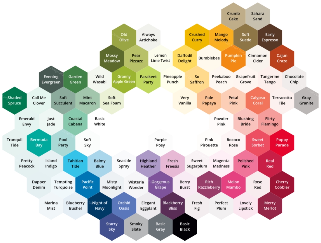
This is the 2017 to 2023 Hex Chart that has the retired Stampin’ Up colors faded. All of the colors that are seen completely are the ones that are currently available in the 2022 to 2023 annual catalog.

With the new 2023 to 2024 annual catalog, we will be saying goodbye to eleven core colors, and the five 2021 – 2023 In Colors. These sixteen colors have faded in the chart above, which shows all the colors from 2017 to 2023.

Let’s take a moment to appreciate these wonderful colors. We know that we always have to say goodbye to the In Colors, after they have had their two years. Evening Evergreen was the wonderful dark green that allowed us to stamp sentiments that were easily read, and it also paired well with many colors. Soft Succulent was a soft, grayish green, that truly reminded me of some of my favorite succulents, and it paired well with the Simply Succulents Bundle. Polished Pink was a very bright pink, and it was a wonderful color to stamp cards for my little girls. Pale Papaya was a delicious soft peachy-orange color, and I loved to layer it, in cardstock and ink forms, with current and retired peachy-orange colors. Fresh Freesia is a color that we must say goodbye as an In Color, but did you know that it will be returning? Why, yes, it will be in the new core colors! I have loved it as a layer and within DSP, but have you tried stenciling and ink blending with it? It is stunning!
For the eleven core colors, we will be sad to see them go. They have been wonderful members of many, many different palettes. Mint Macaron was the soft, grayish, almost true green that was wonderful subtle color in our creations. Bermuda Bay was the very bright teal that stood out; I personally loved it the most, because teal has always been my favorite color. Pacific Point was a great blue that just popped! Rich Razzleberry was a gorgeous reddish-purple that was the lighter shade of Blackberry Bliss. Merry Merlot was a rich, darker red, that made so many wonderful Christmas cards for my family and friends. Blushing Bride was a soft pink that had orange-red undertones; and I loved to ink blend it. So Saffron was the soft, pale yellow-orange; I loved to pair it with many colors, and layer it with the other yellow-orange colors. Mango Melody was the bright yellow-orange that had dominated many of the cards that I have sent over the years; and it was the absolute favorite of one of my daughters. Pear Pizzazz is the toughest to say goodbye to; for it has been my favorite color for plants. (It was amazing how many plants have been featured on my cards!) We also must say goodbye to Sahara Sand, which was a wonderful gray with orange-yellow undertones. It played well with the browns and yellows. Soft Suede was the middle brown, which had red undertones. It was featured in many, many palettes that I used for my cards.
Please check out my Instagram and YouTube channel for the creations I have shared, and you will see some of these colors featured.
Now, let us look at the new and returning colors that Stampin’ Up is giving us with the new 2023 – 2024 annual catalog. We will see seven previous In Colors return to become Core colors. We will have four brand new colors entering the Core colors. Also, we get to have a new set of In Colors. [And yes, I know the names of these new and returning colors, but I will not share them here until Stampin’ Up has announced them.]
I have created a new hex chart with these new and returning colors, which features the colors from 2017 to 2024. I have left the hexagons blank for these ten new colors. [I have seen and featured six of the previous In Colors in my previous Hex Charts, but one is brand new to me. So it is left blank on this new chart.]
So above is the new chart in photo form, where all of the hexagons are not filled with their respective colors. You can print this photo, or you can print the PDF file below. These will remain on my blog, but I will update them in my next blog post (#08). When you return to see the new post, I will discuss these new colors and how to utilize this chart. You will see this chart filled in with all of the wonderful colors available between 2017 and 2024.
Now, when you print this file, you can color it in with your own preferred method. When you use the inks and cardstocks, that you have purchased from your favorite Stampin’ Up demonstrator, you will be able to see the actual hues that you have available to use to create. (So if you have the retired colors, you can see them and work with them on your own projects.)
Your printer does matter. I hope that your printer can handle cardstock. When you print on Basic White cardstock with a laser printer, you can use that chart with any colorization method. If you have a laser printer, you can print the chart on a transparency, so you can overlay it over the colorized versions, and not have the names hidden. When you print on Basic White cardstock with an ink-jet printer, you can use it with all options, except for the Stampin’ Blends.
I would recommend a few methods to colorize it. On your laser printed cardstock chart, you can color with the Stampin’ Blends in your collection; note that not all colors had a pair of Stampin’ Blends. On your printed cardstock chart, you can fill-in or mark the hexagons with your Stampin’ Write Markers. You can find a small image from your favorite Stampin’ Up set, and stamp each ink in the respective hexagon. (I would recommend using a photopolymer stamp, so you can make sure you place it in the correct hexagon.) Last, but not least, colorization option is when you punch (or die cut) appropriately sized pieces of cardstock, and then glue in the respective hexagon. In my recent Instagram post, you can see these options on my 2017 to 2023 version of the chart; I had colorized them last summer, but failed to share them on social media back then.
Now last but not least, here is the awaited black and white 2017 to 2024 Hex Chart, without the names for the new colors, as a PDF.
I hope you enjoy these charts and that you can utilize this tool. I have enjoyed making them!
Until next time,
— Breina

 Chart 1: Current Stampin’ Up Colors effective June 2018
 Chart 2: Stampin’ Up Colors since about 2005 (retired and current)
